Grow Collective

People first, produce second

Brand Creative Direction

01Overview

People first, produce second. A community garden in Forrest Hill where neighbours step past their fences and into something shared. Community gardens usually brand themselves around abundance, which sets a standard most people assume they can't meet. Grow needed the opposite signal: come as you are, you'll figure it out with everyone else.

Brand identity system, character illustration, content creation and direction

Client: Grow Collective

Agency: Heart

Year: 2025
Minimalist GROW logo in tall lime-green letters inside a dark maroon ticket-shaped banner on a solid lime-green background.
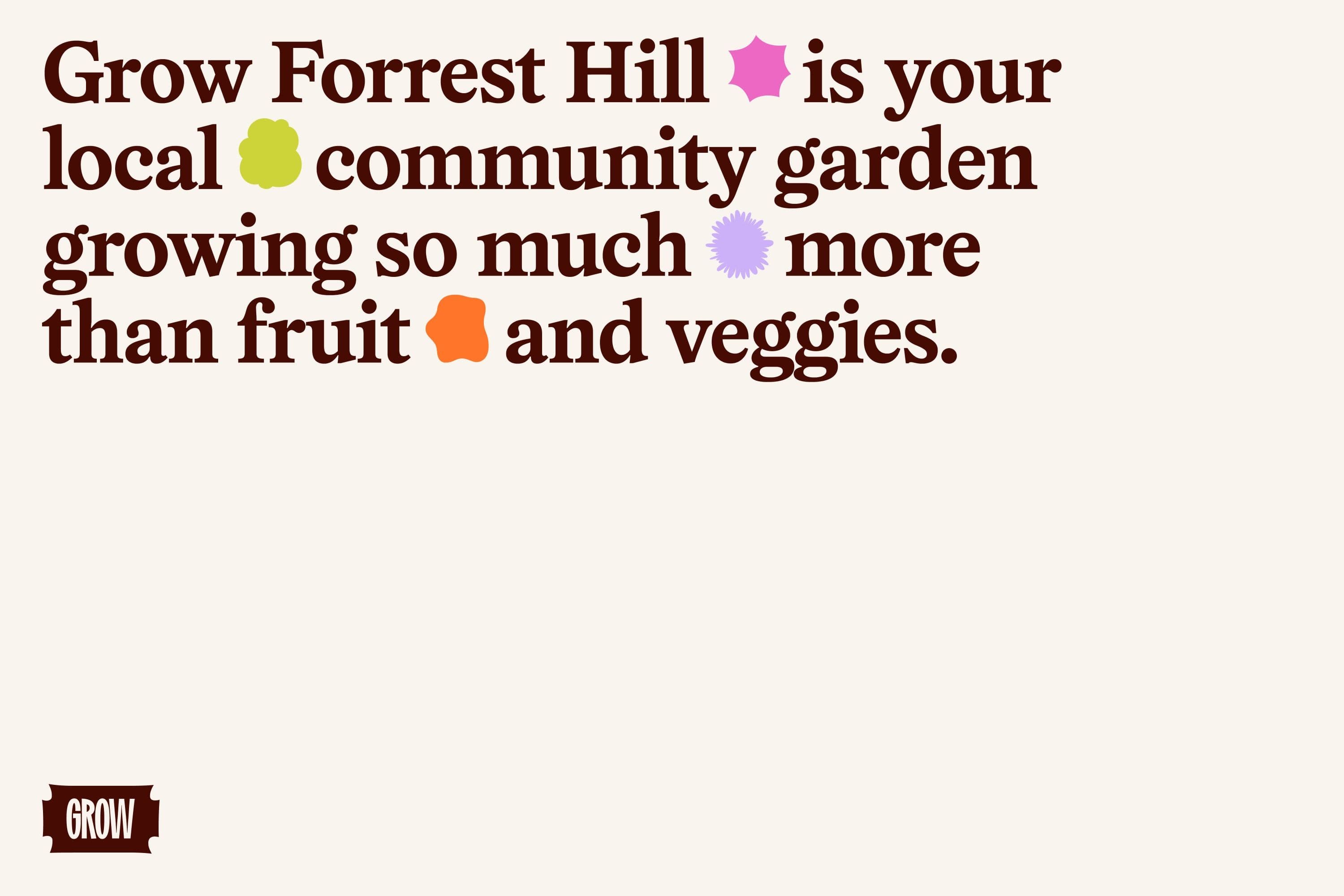
Grow Forrest Hill community garden graphic with bold brown text on a cream background, colourful abstract plant shapes, and a small GROW banner logo.
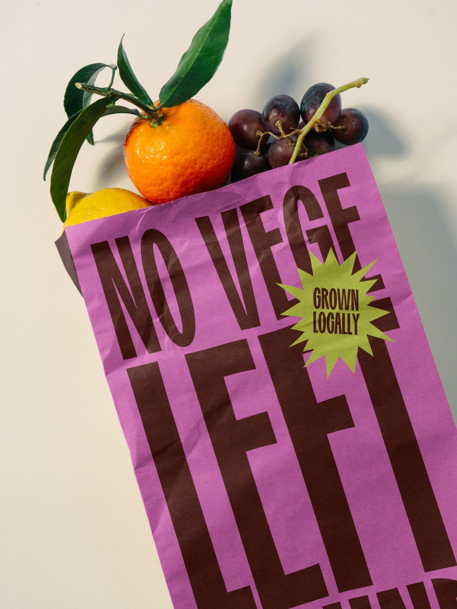
Bright pink paper bag printed with NO VEGE LEFT and a lime-green GROWN LOCALLY starburst, filled with an orange, lemon, and grapes.
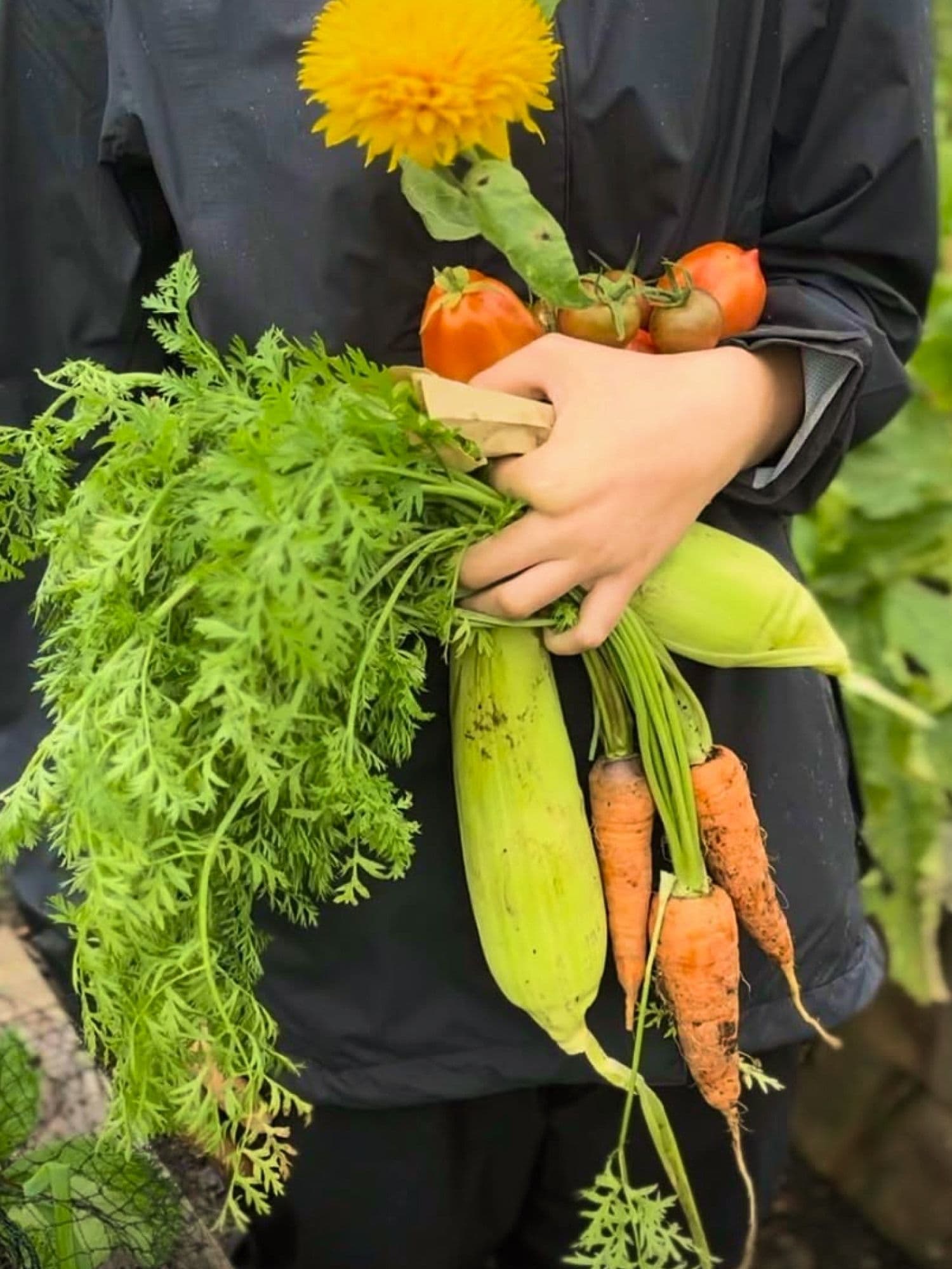
Hands holding a fresh garden harvest of carrots with leafy tops, corn, ripe tomatoes, and a bright yellow flower against soft green foliage.
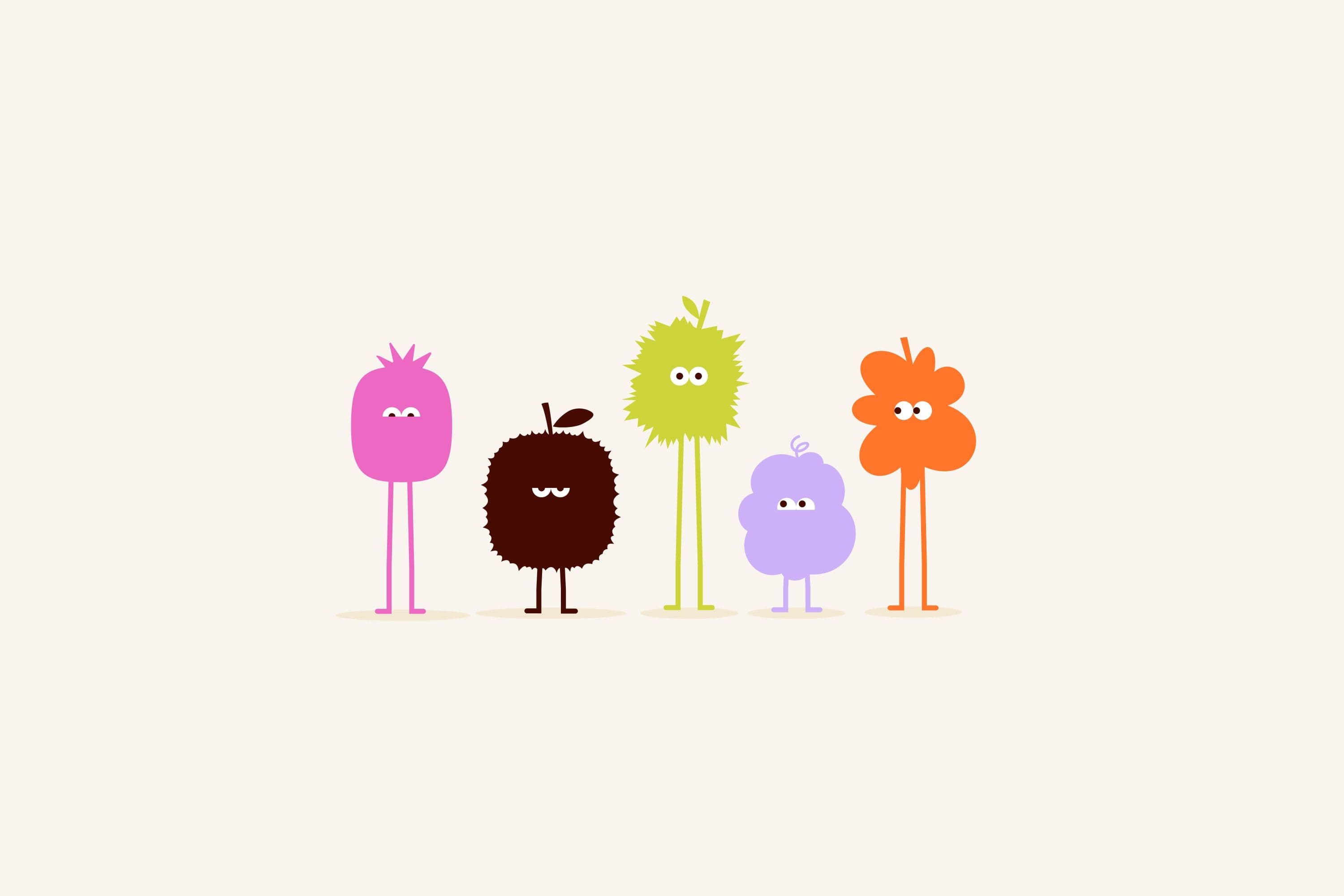
Five whimsical fruit- and plant-inspired cartoon characters with thin stick legs standing in a row on a cream background.
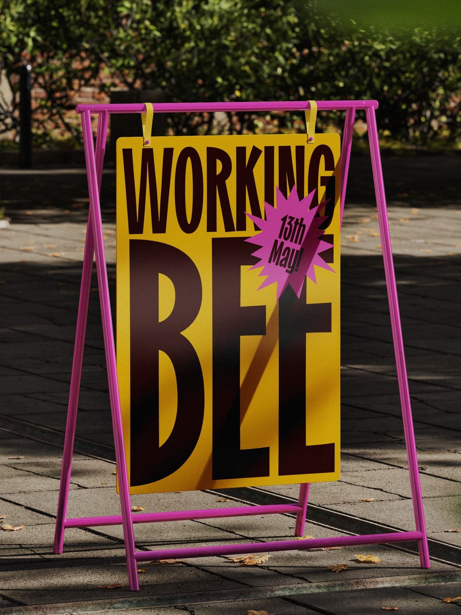
Outdoor yellow A-frame sign with magenta frame reading WORKING BEE and a pink starburst dated 13th May, on a sunny paved garden path.
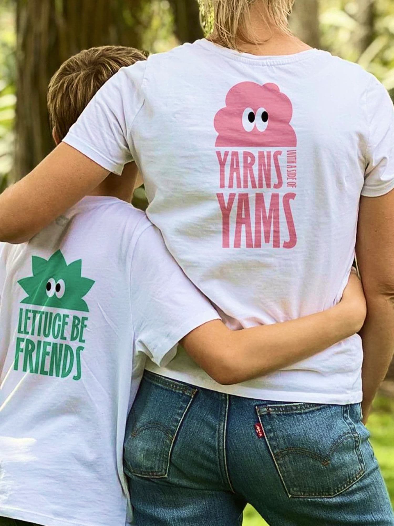
Woman and young boy seen from behind hugging in a garden, wearing white tees with lettuce and yam character puns.

02Brand

The brand had to work on the ground, not in a deck. It runs across signage, working bees, community dinners, and workshops, so the same voice greets someone at the gate as invites them back.

The system is deliberately loose. Volunteers apply it themselves, and it holds together when hand-drawn on a chalkboard or printed for an event.
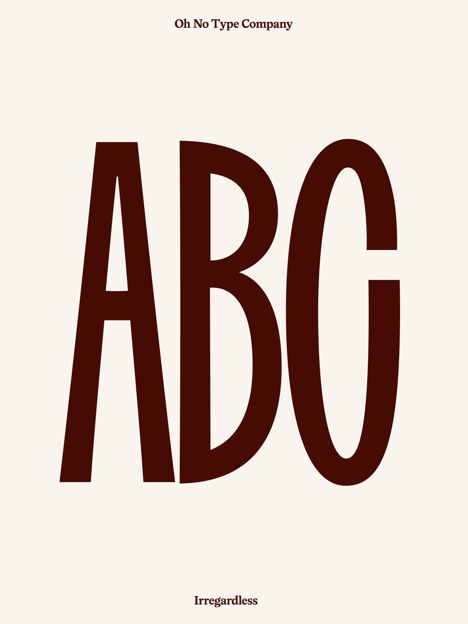
Typography poster from Oh No Type Company showing tall condensed ABC letters in dark brown on cream, labelled Irregardless at the bottom.
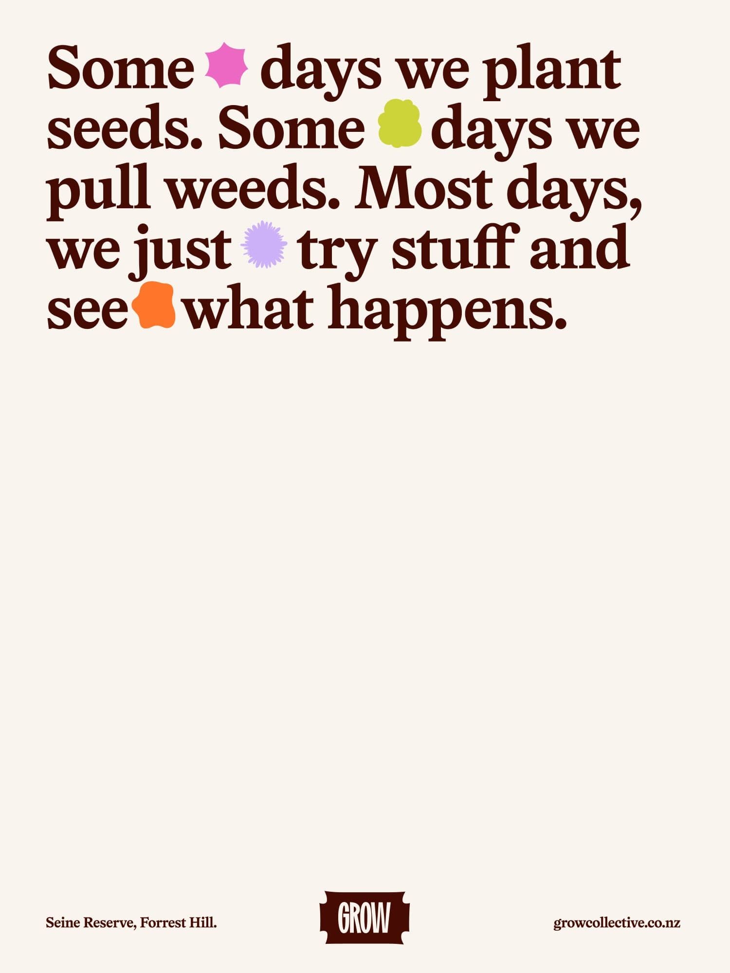
Cream poster with a Grow Collective quote about planting seeds and pulling weeds, accented by colourful abstract shapes, location Seine Reserve Forrest Hill, and growcollective.co.nz.
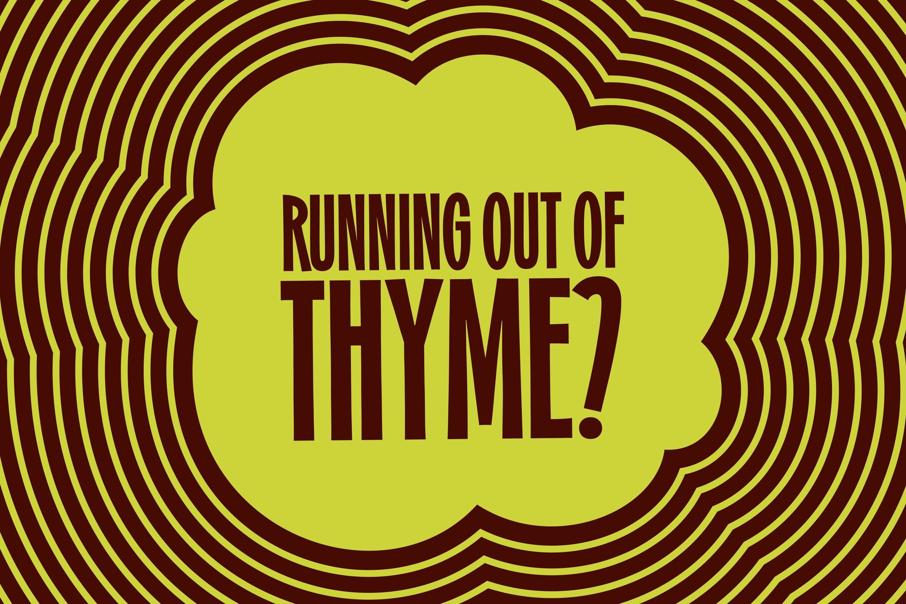
Graphic reading RUNNING OUT OF THYME? in bold condensed brown type on a lime field with concentric wavy brown outlines.
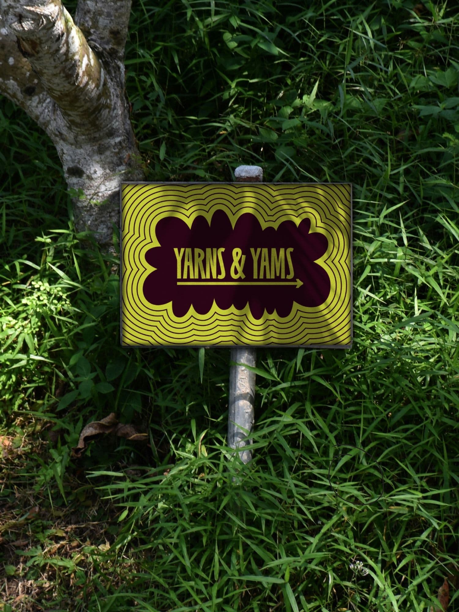
Outdoor garden sign reading YARNS & YAMS with a yellow and maroon wavy pattern, planted in grass beside a tree.
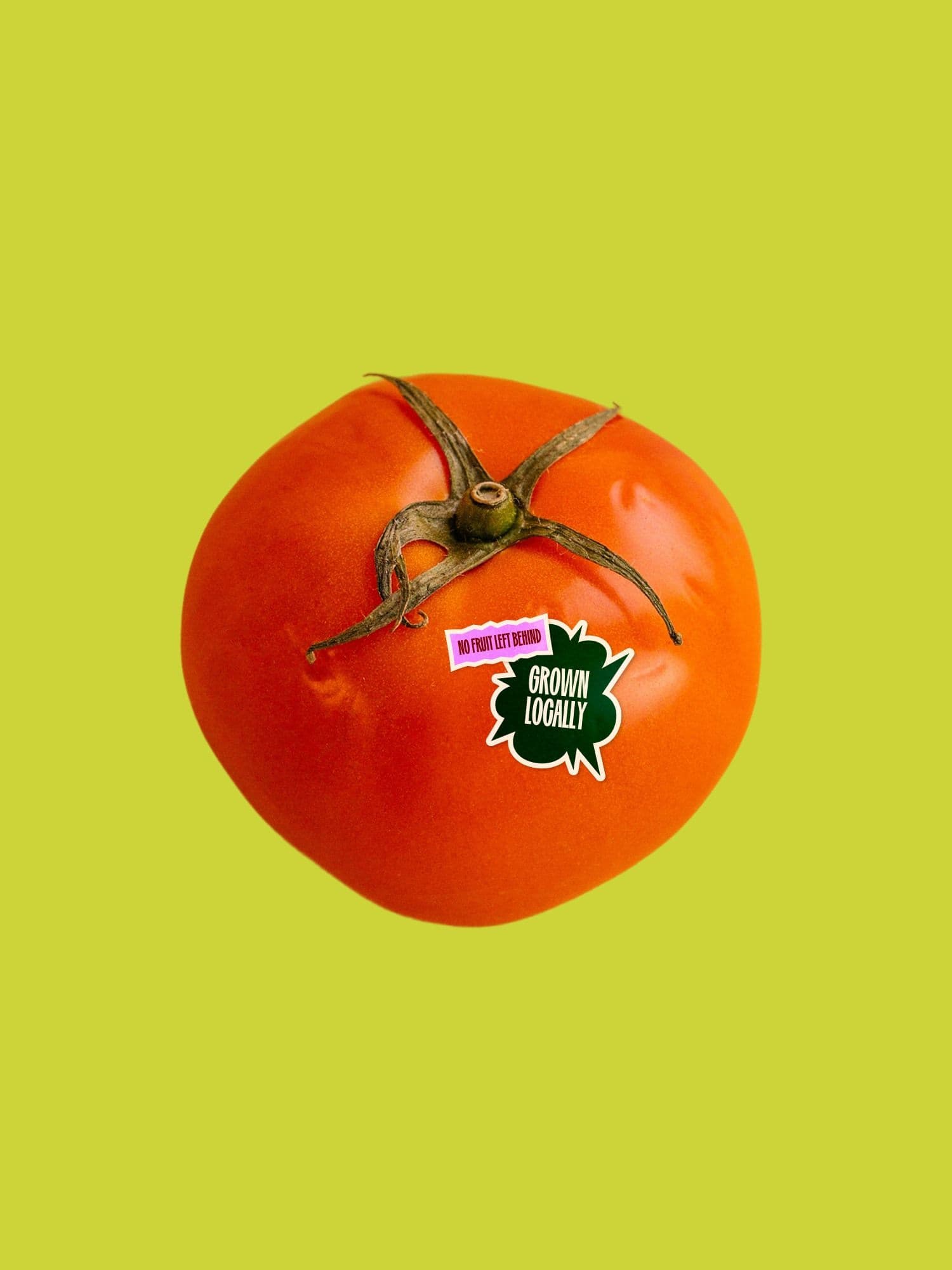
Red tomato on a lime-green background with stickers reading NO FRUIT LEFT BEHIND and GROWN LOCALLY.
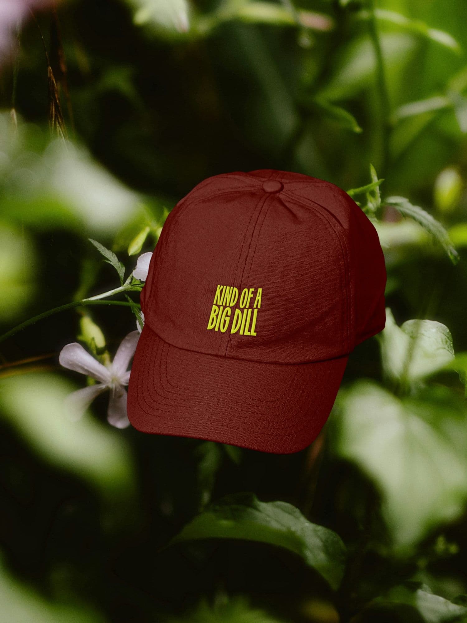
Maroon baseball cap embroidered KIND OF A BIG DILL in yellow, photographed against soft-focus green garden foliage.
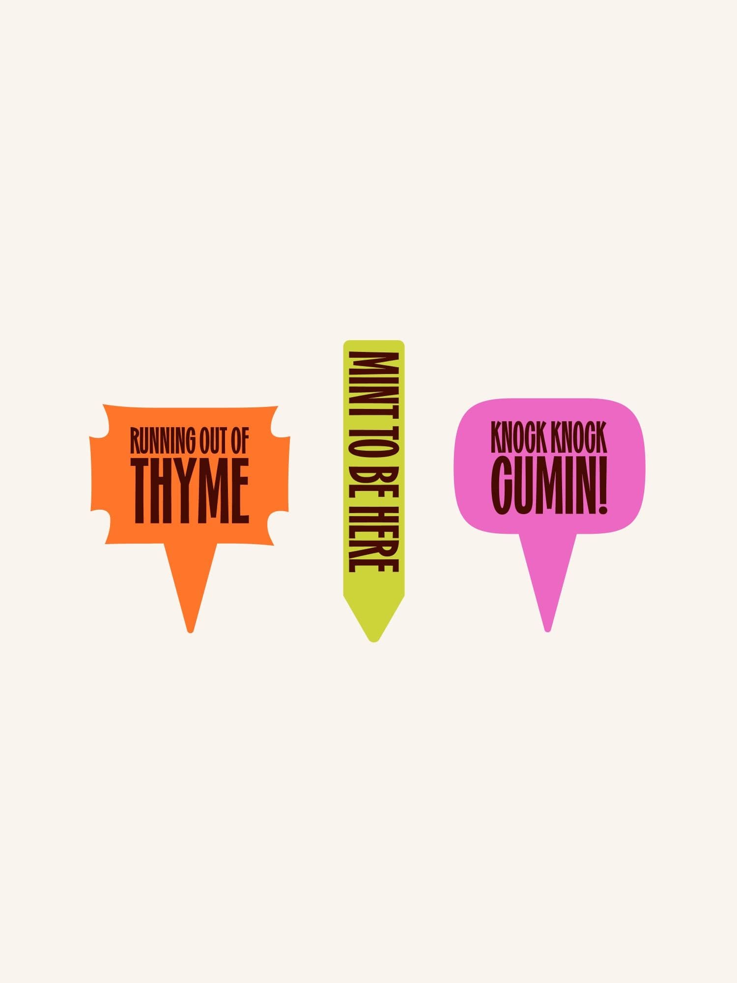
Three playful herb plant markers on cream: RUNNING OUT OF THYME, MINT TO BE HERE, and KNOCK KNOCK CUMIN!
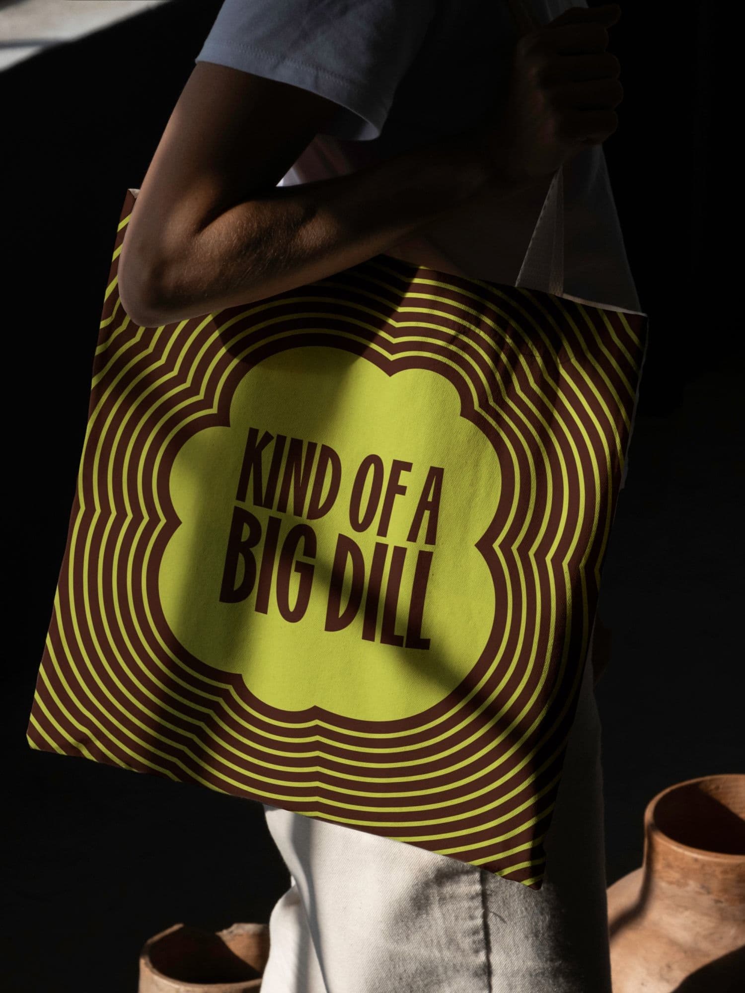
Person carrying a canvas tote with KIND OF A BIG DILL in a lime-green scalloped graphic surrounded by concentric brown and green waves.